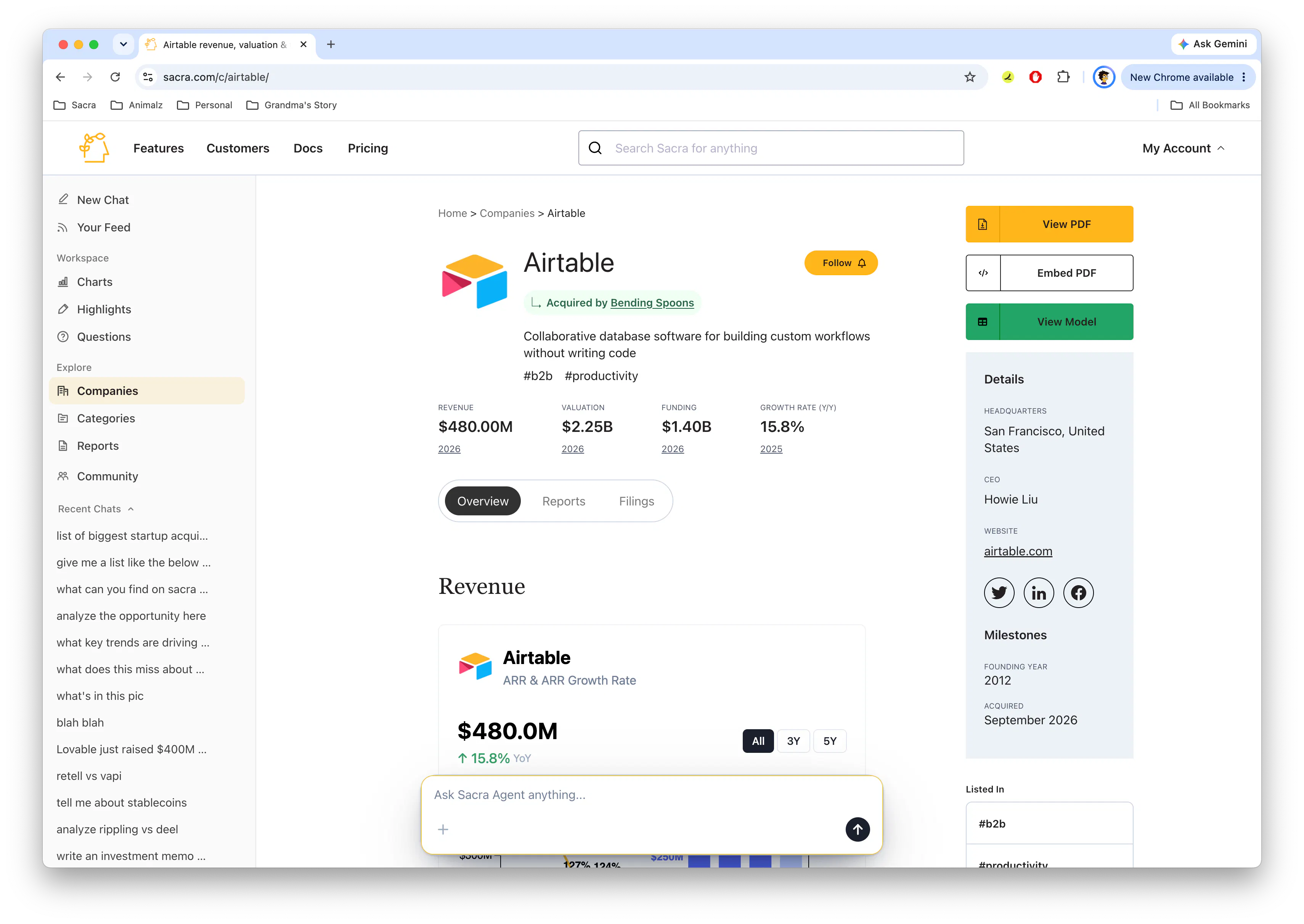
You can now generate charts directly in Sacra Agent. Ask for a company's revenue growth, compare multiple companies, visualize funding history, or create market maps, all using Sacra's private company data.
Sacra Agent turns your request into a chart with company branding, financial data, and cited sources, without having to pull the numbers into a spreadsheet and build it yourself.
Chart generation is available in Sacra Agent on the web, over email, and in Slack.
Get started: Create a chart with Sacra Agent →
Create charts from a prompt
A lot of private company research involves comparing companies on revenue, growth rates, valuations, and other financial metrics.
Now you can ask Sacra Agent to generate the chart you need.
Try asking:
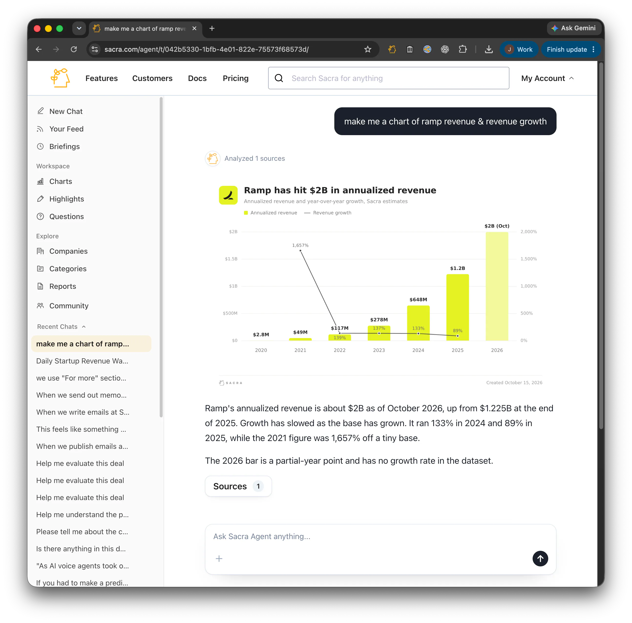
- Make a chart of Ramp's revenue and growth over time.
- Compare Cal.com and Retell's revenue growth.
- Show me the 10 most valuable AI companies.
- Chart Stripe's funding history and valuation over time.
- Create a market map of AI coding companies, with revenue on the x-axis, growth on the y-axis, and bubble size representing valuation.
Sacra Agent pulls the relevant data, selects a chart format, and generates a visualization with company logos, colors, labels, and sources.
Charts also come with an explanation of the underlying data and trends, so you can see what the numbers mean and where they came from.
What you can create
Sacra Agent supports several types of charts, depending on the data you're trying to visualize.
- Revenue and growth charts: Annual revenue bars with year-over-year growth rates, using the company's logo and brand colors.
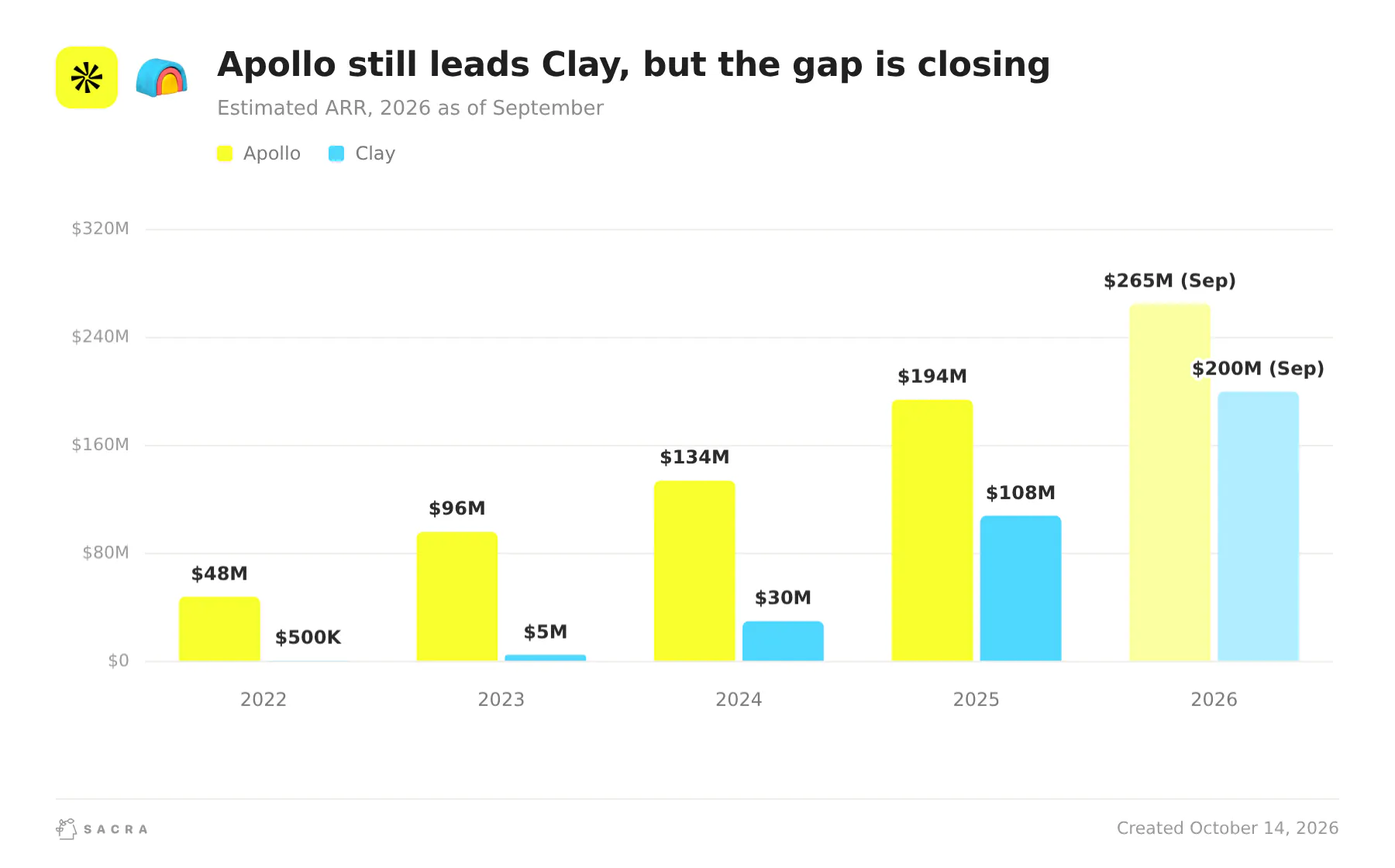
- Company comparisons: Compare revenue across 2-4 companies over time, using consistent metrics and overlapping reporting periods.
- Funding history: Visualize a company's funding rounds, amounts raised, and post-money valuations.
- Rankings: Rank companies by revenue, valuation, total funding, or other financial metrics.
- Market maps: Plot companies against metrics like revenue and growth, with bubble sizes representing valuation.
- Custom visualizations: Create line charts, scatter plots, bubble charts, pie charts, and other visualizations based on your request.
For revenue charts, Sacra Agent distinguishes between ARR, annualized revenue, and trailing revenue, and labels partial-year figures so you can see exactly what's being compared.
Instead of manually gathering data and building charts, you can go from a question to a visualization using the same Sacra research and data you already rely on.
Getting started
Chart generation is available now in Sacra Agent on the web, over email, and in Slack.
Start a new chat, describe the chart you want, and Sacra Agent will build it.
Questions or feedback, email us at founders@sacra.com.